Content
Rethinking the traveling experience
Zormor is a startup that aims to revolutionize the traveling experience with unique features. I worked with them on the UX/UI Design of the first version of the mobile app.
Webapp V.2.
Preview
Dev mode
Astrazeneca
Share
Overview
Engage
Contacts
AI Assistant
Public Company
AstraZeneca is a pharmaceutical company that discovers, develops, manufactures, and markets prescription medicines.
Biopharma
Biotechnology
Healthcare
Medical
Pharmaceutical
Precision medicine
Industry
Pharma
Headquarters
Cambridge, UK
Employees
10,000+
Website
www.astrazeneca.com
How they Make Money?
- Index and data licensing fees from financial products
- Listing fees from companies joining the NASDAQ exchange
- Technology and software solutions for financial institutions
- Financial crime management and regulatory technology
- Trading and market services revenue
How they Loose Money?
- Market volatility reducing trading volumes
- Decreased IPO activity
- Competition from other exchanges and technology providers
- Regulatory compliance costs
- Technology investment and integration expenses
Company Analytics
Data updated as of February 28, 2025
Employee Distribution
Growth Areas
Skills
Headcount Trend
By Role
By Location
Facts
- Market volatility reducing trading volumes
- Decreased IPO activity
- Competition from other exchanges and technology providers
- Regulatory compliance costs
- Technology investment and integration expenses
Show all
Emails
Documents
Draft content
Outreach email
Crafted message designed to engage potential prospects, clients, or partners by introducing your value proposition and initiating a conversation.
Email
Updated 3 days ago
Value Hypothesis
A concise, tailored statement that clearly articulates the specific value your solution brings to a particular account, making your outreach more relevant and impactful.
Document
Updated 3 days ago
Account Summary
A one-page snapshot highlighting key insights, priorities, and opportunities within a target account, enabling more personalized and informed engagement.
Document
Updated 3 days ago
Call Script
A structured, conversational guide to help navigate discovery or sales calls confidently, ensuring you cover critical questions and value points.
Document
Updated 3 days ago
Follow Up Email
A thoughtfully crafted email to re-engage prospects after a call or meeting, reinforcing value and outlining clear next steps to keep momentum going
Email
Updated 3 days ago
Value Pyramid
A layered breakdown of customer pains, desired outcomes, and strategic benefits, helping you connect your solution to what matters most for each account.
Document
Updated 3 days ago
Value Pyramid
Three Whys
Discovery Questions
Vision
NASDAQ's vision is to be the trusted fabric to the world's financial system, providing world leading platforms that enhance the liquidity, transparency and integrity of the world's economy.
Strategies
- Leverage AI across businesses, with 50 AI-powered products and focus on enhancing capabilities through AWS collaboration.
- Accelerate cloud adoption for owned and operated markets, with 2 already migrated to AWS.
- Modernize data management to unlock full potential of cloud and AI ambitions.
- Integrate Acxiom SL and Calypso into global operating model for improved quality and cloud adoption.
- Implement AI initiatives both in products and business operations to enhance efficiency and value.
Initiatives
- Leverage AI across businesses, with 50 AI-powered products and focus on enhancing capabilities through AWS collaboration.
- Accelerate cloud adoption for owned and operated markets, with 2 already migrated to AWS.
- Modernize data management to unlock full potential of cloud and AI ambitions.
- Integrate Acxiom SL and Calypso into global operating model for improved quality and cloud adoption.
- Implement AI initiatives both in products and business operations to enhance efficiency and value.
Challenges
- Leverage AI across businesses, with 50 AI-powered products and focus on enhancing capabilities through AWS collaboration.
- Accelerate cloud adoption for owned and operated markets, with 2 already migrated to AWS.
- Modernize data management to unlock full potential of cloud and AI ambitions.
- Integrate Acxiom SL and Calypso into global operating model for improved quality and cloud adoption.
- Implement AI initiatives both in products and business operations to enhance efficiency and value.
Value Paths
- Leverage AI across businesses, with 50 AI-powered products and focus on enhancing capabilities through AWS collaboration.
- Accelerate cloud adoption for owned and operated markets, with 2 already migrated to AWS.
- Modernize data management to unlock full potential of cloud and AI ambitions.
Search
Add Contacts
Select all 7 contacts
Page 1 of 1
Name
Role
Location
Tag
Lena Morales
Head of AI
United States
Decision Maker
Sarah Mitchell
CEO
United States
Decision Maker
Emily Ross
Head of Sales
United States
Champion
Tom Bennett
CMO
United Kingdom
Decision Maker
Jason Carter
VP of Marketing
United Kingdom
Champion
Amelia Hughes
CTO
United States
Technical Buyer
Marcus Thompson
Solutions Architect
United States
Technical Buyer
Hi, How can I help you today?
Write a message...
Summarise the latest news and updates
Summarise the latest news and updates
Create an engagement plan for Q2
01 Intro
In late 2024 I joined PG:AI as their first product designer. What started as a quick conversation about a website redesign turned into a close collaboration across product, brand, and strategy. We redesigned the entire app, launched a new marketing site, and I helped the team move faster with more clarity. This is the story of what we built and what I learned along the way.
How it all started...
I first connected with Ed (PG:AI's Co-Founder) while I was living in London, right after finishing my master’s. I was looking for freelance gigs and came across a post looking for a website redesign. We jumped on a call to talk about the project, but the conversation quickly shifted. We started talking about the product, the vision, and what he wanted to build with PG:AI.
I had some previous experience working with startups, so we found common ground and discussed a few ideas on the best way to position the product, messaging, and more.
In the end, he didn’t pick me for the website job. But he did ask if I would be interested in working on the product itself. PG:AI was starting to gain traction, and they needed a designer to help take it to the next level.
We started working in November 2024...

🤝

02 Before
Where was PG:AI at that moment?
At the time, PG:AI had a powerful idea and early traction. The team was moving fast, shipping features, and already had paying users. But there was no design system, no clear visual identity, and no real product roadmap.
Ed was looking for someone to take ownership of the product, turn ideas into functional designs, and help craft awesome experiences for their users.
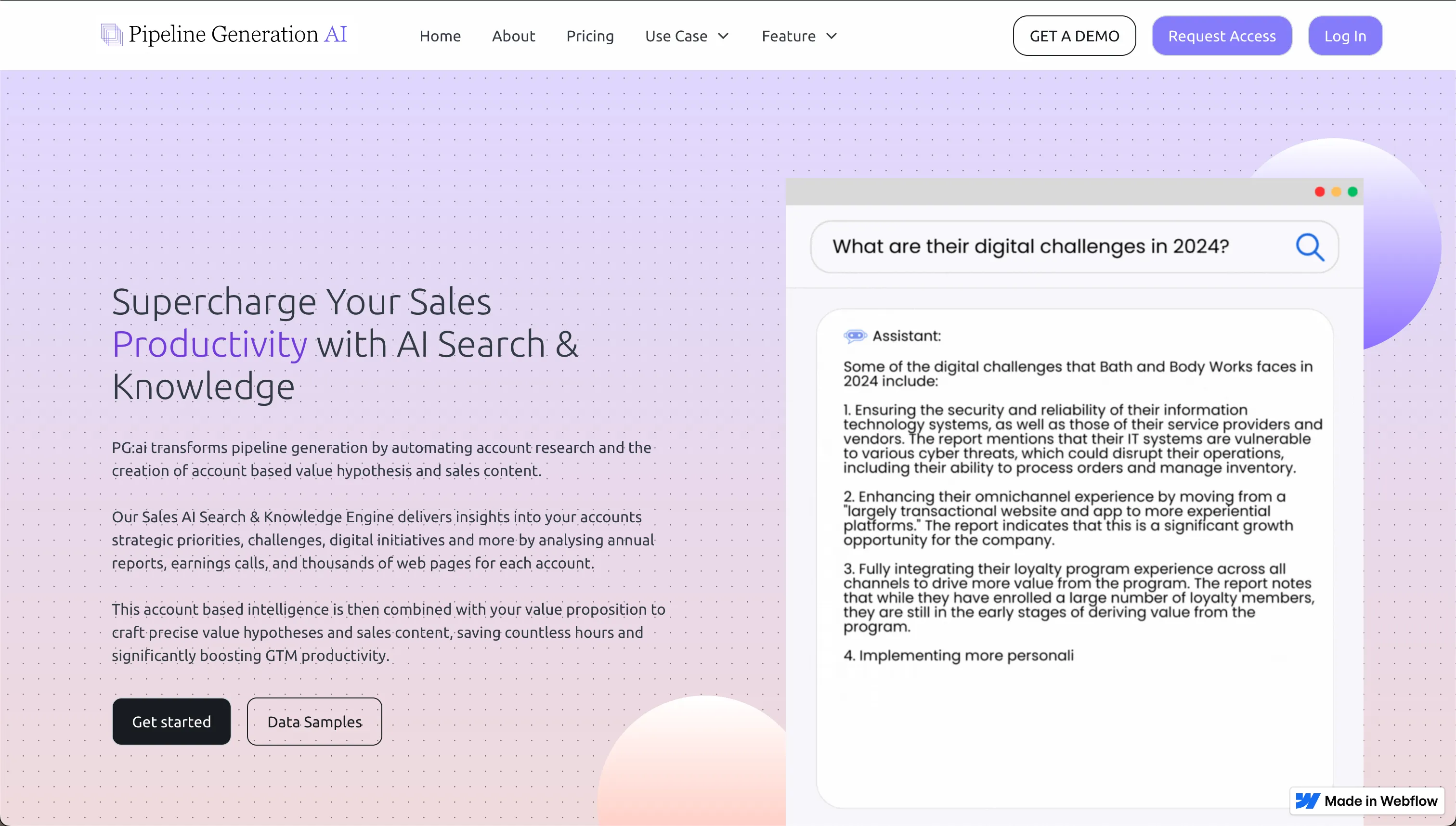
Website - Nov 2024
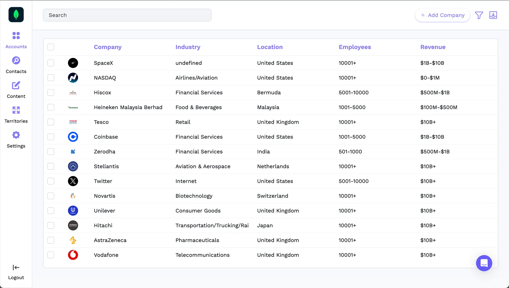
Webapp - Accounts Page - Nov 2024
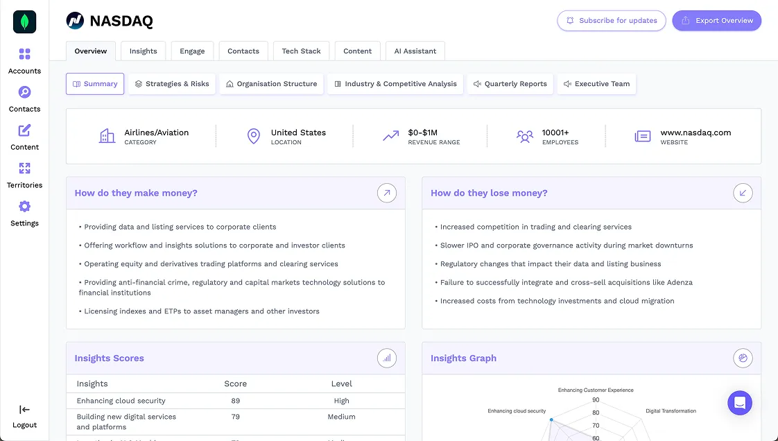
Webapp - Overview - Nov 2024
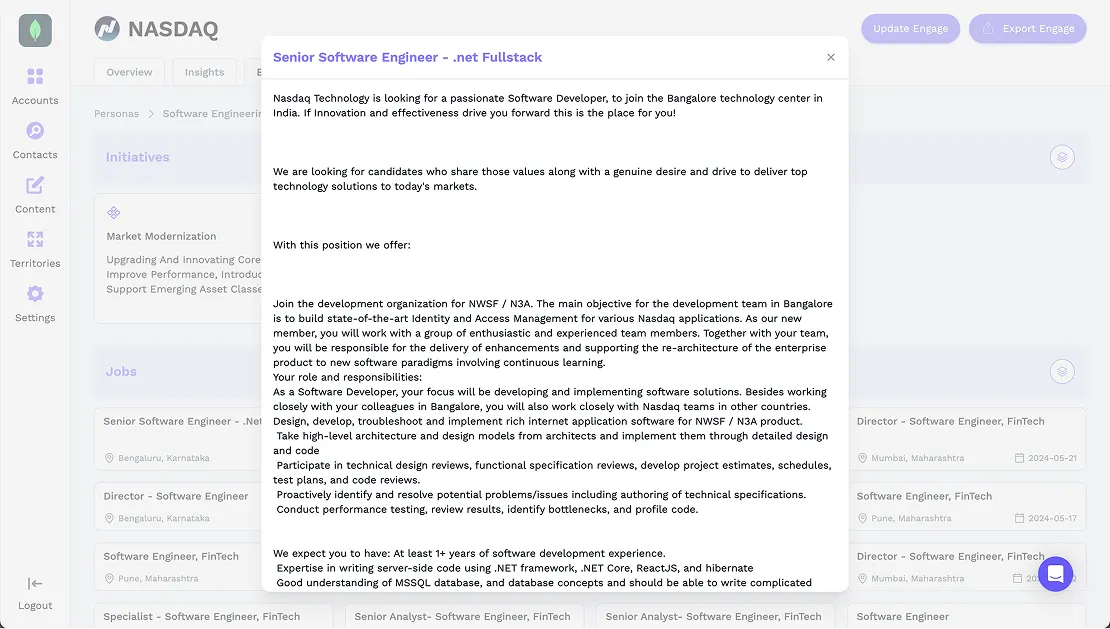
Webapp - Modal - Nov 2024
03 What I did
Design System or "Design Toolkit"
If you look at big tech companies like Google, Uber, or Apple, you’ll notice they have very complex and rigid design systems with thousands of rules, components, and guidelines. In my experience, when working with startups, aiming for something like that is not scalable and actually slows down progress rather than helping.
The whole idea of having a design system is to speed up the design process while maintaining consistency and visual harmony. But in a high-speed environment, where everything changes and you iterate constantly, you need something that gives you the flexibility to play around, try multiple options, and at the same time help you move faster.
I would call this a “Design Toolkit,” a small library of styles and components that I can reuse to explore ideas and create concepts and UIs with flexibility and speed. I got this term from this Dive Club video. It summarizes the idea really well and shines a light on how to approach product design at a startup.
Styles
Components
Button
Button
Button
Button
Button
Button
Button
Button
Button
Button
Button
Button
Button
Button
Button
Button
Button
Button
Button
Button
Button
Button
Button
Button
Button
Button
Button
Button
Sidebar Button
Search Bar
Search
Something|
Input Field
Write Somethig
Placeholder
Select Something
Placeholder
Say something
Placeholder
Toggle
Radio Button
Checkbox
Filter
Filter
Filter
Filter
Typography
Default
Inter
Ag
ABCDEFGHIJKLMNOPQRSTUVWXYZ
abcdefghijklmnopqrstuvwxyz
0123456789 !@#$%^&*()
H1
Font size: 56px / 3.5rem | Line height: 62px / 3.875rem
H1 Light
H1 Regular
H1 Medium
H1 Semibold
H2
Font size: 40px / 2.5rem | Line height: 48px / 3rem
H2 Light
H2 Regular
H2 Medium
H2 Semibold
H3
Font size: 28px / 2rem | Line height: 38px / 2.375rem
H3 Light
H3 Regular
H3 Medium
H3 Semibold
H4
Font size: 24px / 1.5rem | Line height: 32px / 2rem
H4 Light
H4 Regular
H4 Medium
H4 Semibold
Text xl
Font size: 20px / 1.25rem | Line height: 30px / 1.875rem
Text xl Light
Text xl Regular
Text xl Medium
Text xl Semibold
Text lg
Font size: 18px / 1.125rem | Line height: 28px / 1.75rem
Text lg Light
Text lg Regular
Text lg Medium
Text lg Semibold
Text md
Font size: 16px / 1rem | Line height: 24px / 1.5rem
Text md Light
Text md Regular
Text md Medium
Text md Semibold
Text sm
Font size: 14px / 0.875rem | Line height: 20px / 1.25rem
Text sm Light
Text sm Regular
Text sm Medium
Text sm Semibold
Text xs
Font size: 12px / 0.75rem | Line height: 16px / 1rem
Text xs Light
Text xs Regular
Text xs Medium
Text xs Semibold
Colors
Base colors
Base
White
#FFFFFF
Black
#090E19
Gray
Gray 50
#F9FAFB
Gray 100
#F2F4F7
Gray 200
#EAECF0
Gray 300
#D0D5DD
Gray 400
#98A2B3
Gray 500
#667085
Gray 600
#475467
Gray 700
#344054
Gray 800
#1D2939
Gray 900
#101828
Purple
Purple 50
#F3F3FF
Purple 100
#DFDBFD
Purple 200
#C9C3FC
Purple 300
#AEA4FA
Purple 400
#9386F9
Purple 500
#5D4AF6
Purple 600
#4E3ECD
Purple 700
#3E31A4
Purple 800
#2F257B
Purple 900
#1F1952
Semantic tokens
Backgrounds
Elements
White
Main
#F9FAFD
Error
Error 50
Success
Success 50
Warning
Warning 50
Text
Placeholders
Gray 400
Descriptive
Gray 500
Body
Gray 700
Title
Gray 800
Error
Error 600
Success
Success 600
Warning
Warning 600
Borders
Default
Gray 200
Active
Purple 300
Error
Error 600
Success
Success 600
Warning
Warning 600
Product Strategy
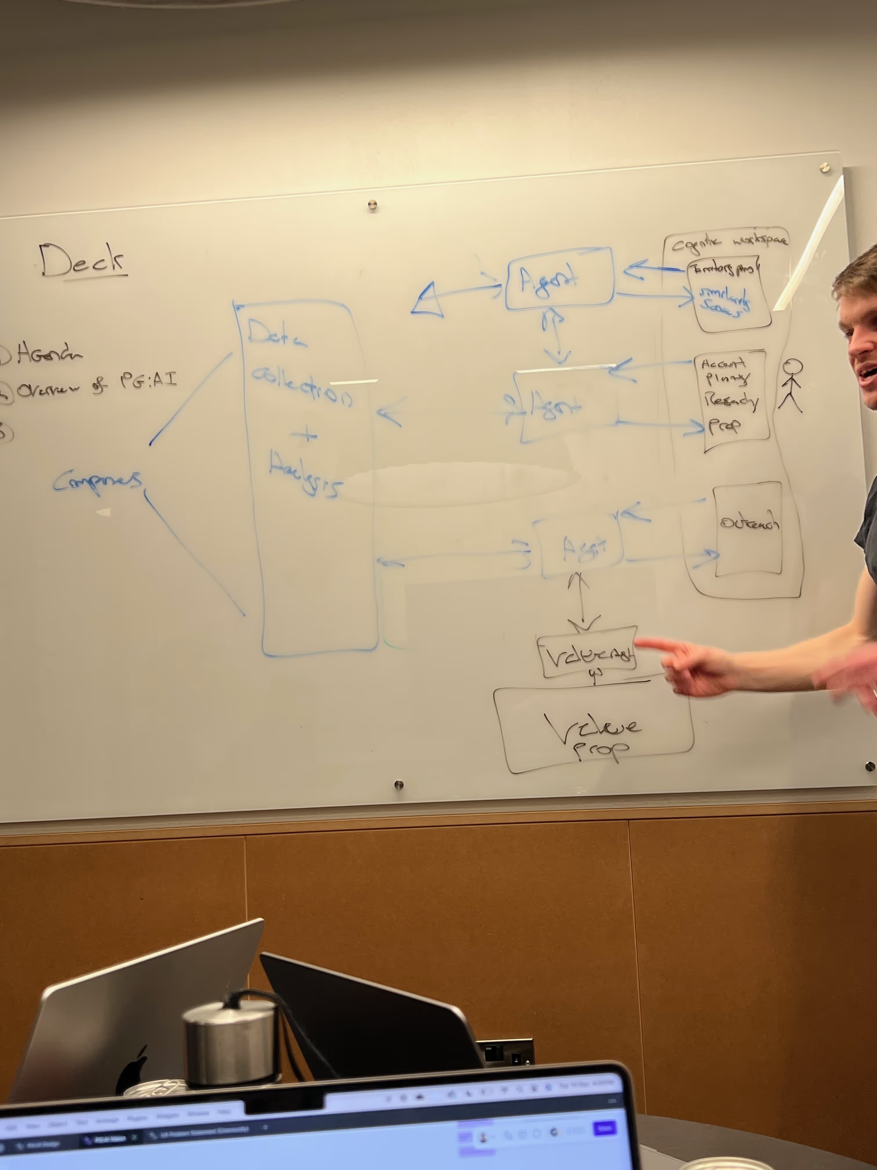
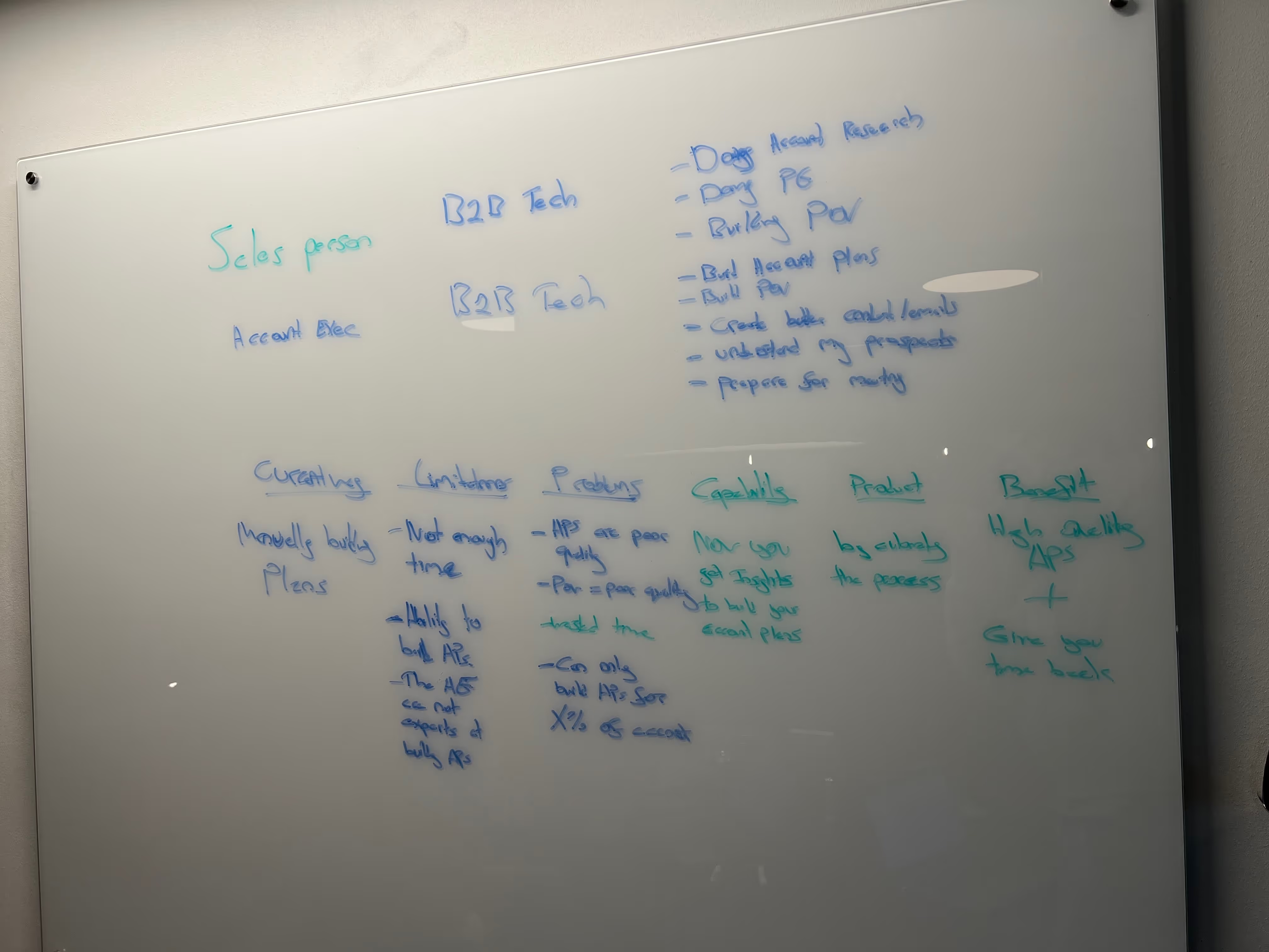
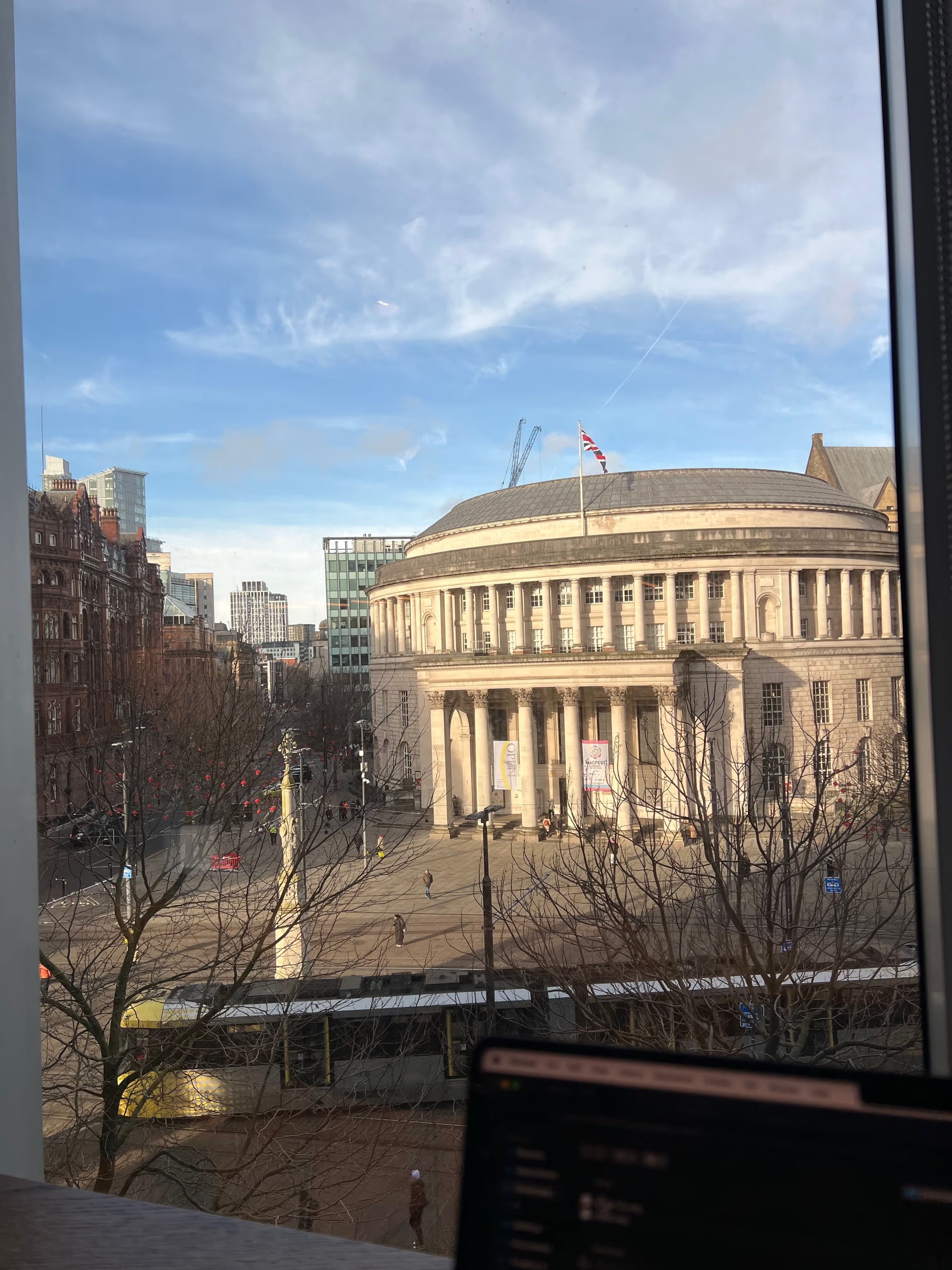
A few weeks after joining the team, we met in the Manchester office to talk about business and product strategy. I believe remote work is the best way to operate, at least for serious people with a strong sense of ownership, but there’s nothing like an in-person session, especially when it comes to long-term strategy and envisioning the future of what we’re building.
We talked about our vision for the product, established the messaging, and built a roadmap with the features we wanted to build over the next few months. Of course, this roadmap is constantly changing, as you’d expect from an early-stage startup. But it’s a necessary first step to align the team around a common vision and start moving in the right direction.

UI Refresh
Once I had the design toolkit in place and a better sense of the product vision, one of the first things I did was a complete UI refresh to achieve a consistent look and feel across the app. This process also helped me to get very familiar with the app, I got to know all of the possible user flows and edge cases.
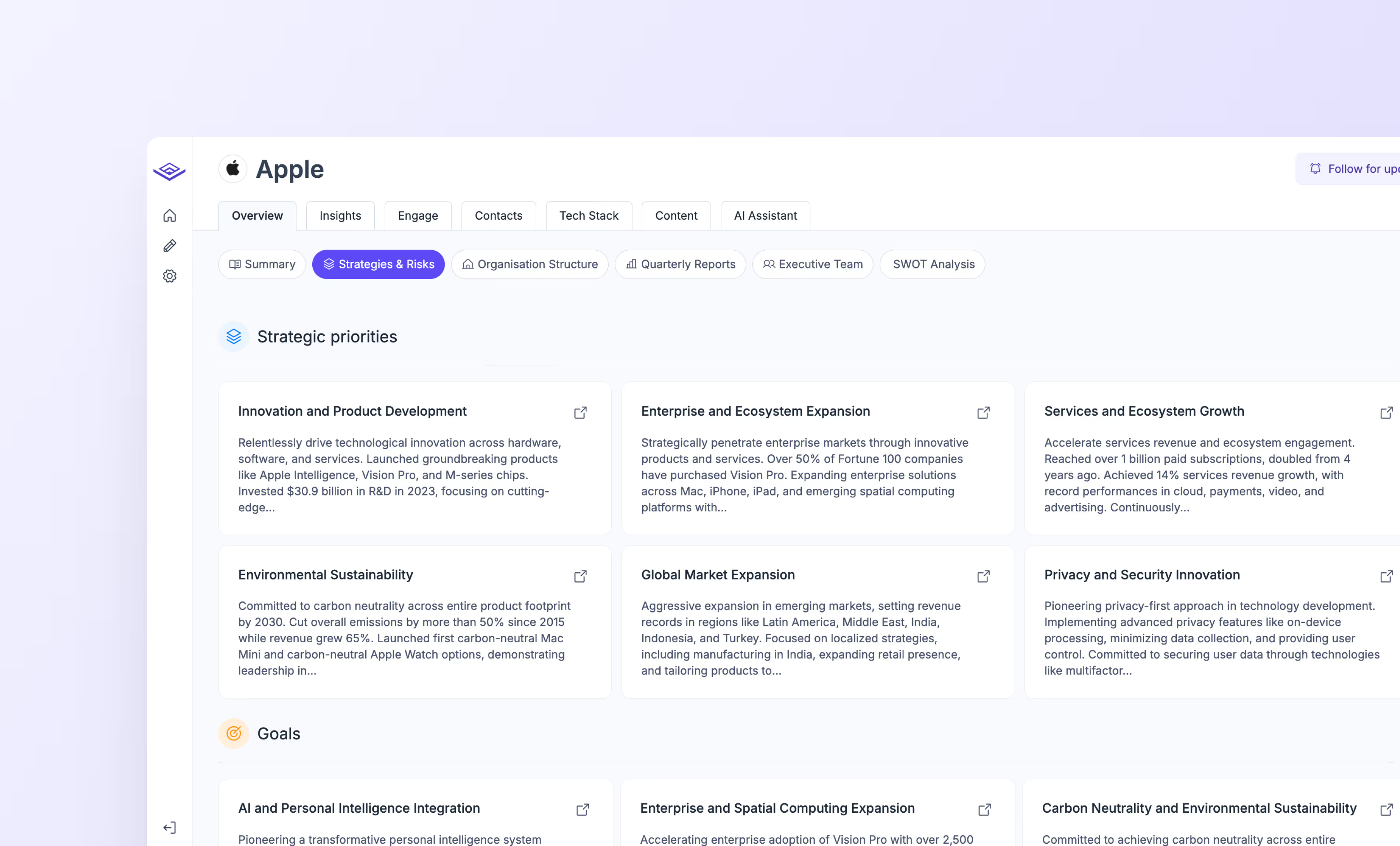
One key thing I noticed here was that it’s important to follow up on how your designs are implemented. Sometimes you create something that looks great in Figma, but when you see it live in the app, it feels off. That can happen due to variables that aren’t considered in a static design, like how it adapts to different screen sizes, how the interactions feel, how empty or loading states are handled, or how real data fits into the layout. That’s why I started getting more involved in the development process.
Enhancing the UX
This challenge made me think beyond just static screens. I started looking at ways to improve the overall experience, like improving the navigation, making the app feel more interactive, and covering edge cases like loading states, empty states, and error messages. Here’s what we did to make the experience feel better
Improving Navigation (Drawer Menu)
The first issue we faced was that it was a bit difficult to navigate through the app and zoom in and out of specific insights. For context, the app has multiple boxes or cards representing strategic priorities, goals, risks, and relevant insights.
When thinking about navigation, I asked myself: how can we allow users to zoom in on a specific insight without losing context, and also encourage them to take action (e.g. write an email, dig deeper into the insights, etc.)?
I designed a drawer menu that allows users to view an in-depth explanation of a specific insight, access its sources, and get recommended actions and guidance. The final result made the app easier to explore and gave us a reusable way to support future features, like showing AI Assistant sources or opening documents.
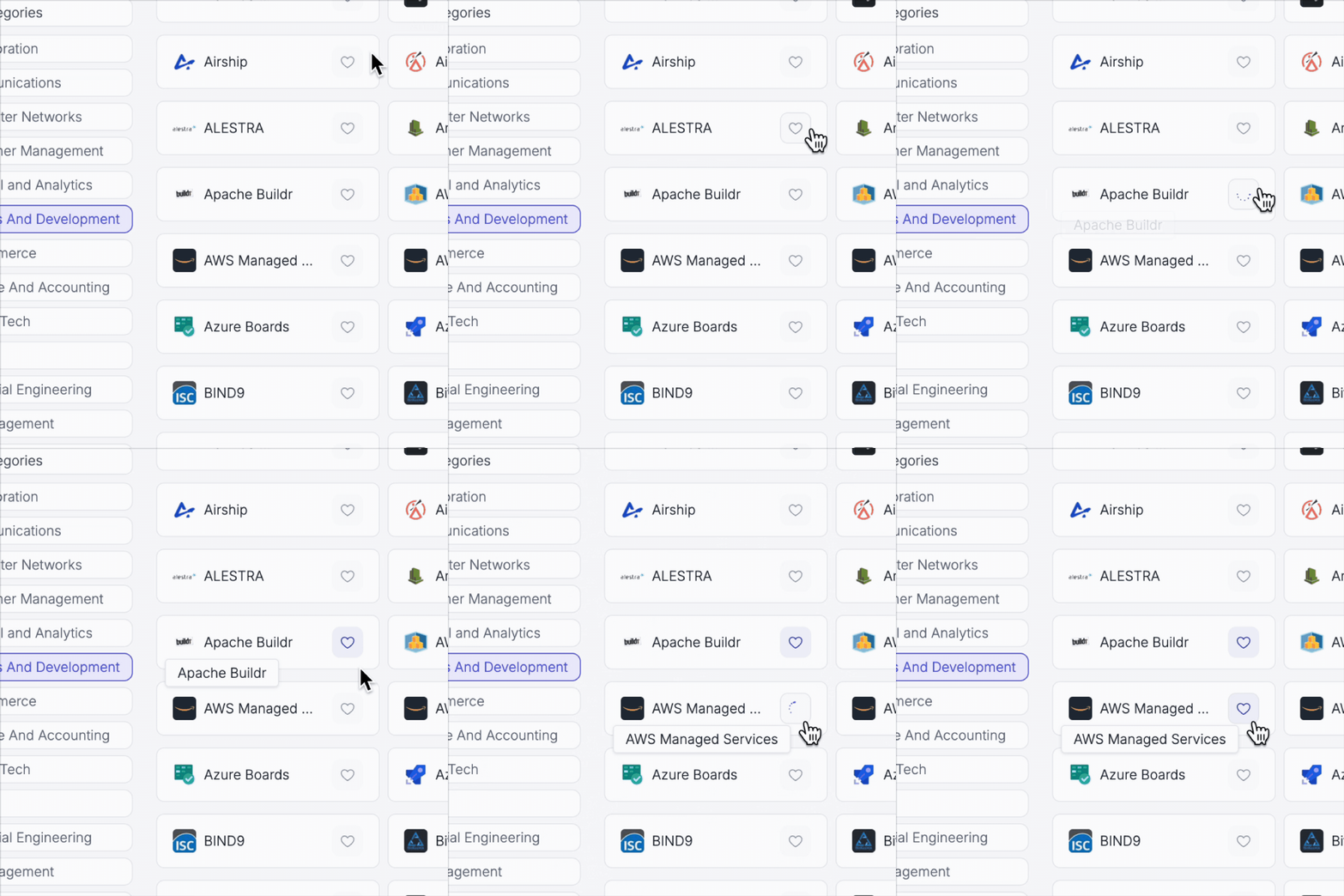
Hover States and Micro-Interactions
One thing that makes a huge difference when using a product or even a website is how it responds to your actions. Small details like hover states and micro-interactions can completely change how smooth and polished the experience feels. It wasn’t something I used to prioritize much in my design process, but I’ve realized it makes a big impact.
Here are some examples we implemented throughout the app:
Adding favourites micro-animation
.gif)
Insight cards hover state
Empty States and Alerts
Another important thing in design is making sure users know what’s going on in the background. Empty states with clear messages help show that content is loading or that there’s just nothing to display, instead of making users think something’s broken. Confirmation and error messages also matter a lot, as they give quick feedback so users know if things are working or if something went wrong, and what they can do about it. We managed to implement these all across the app:
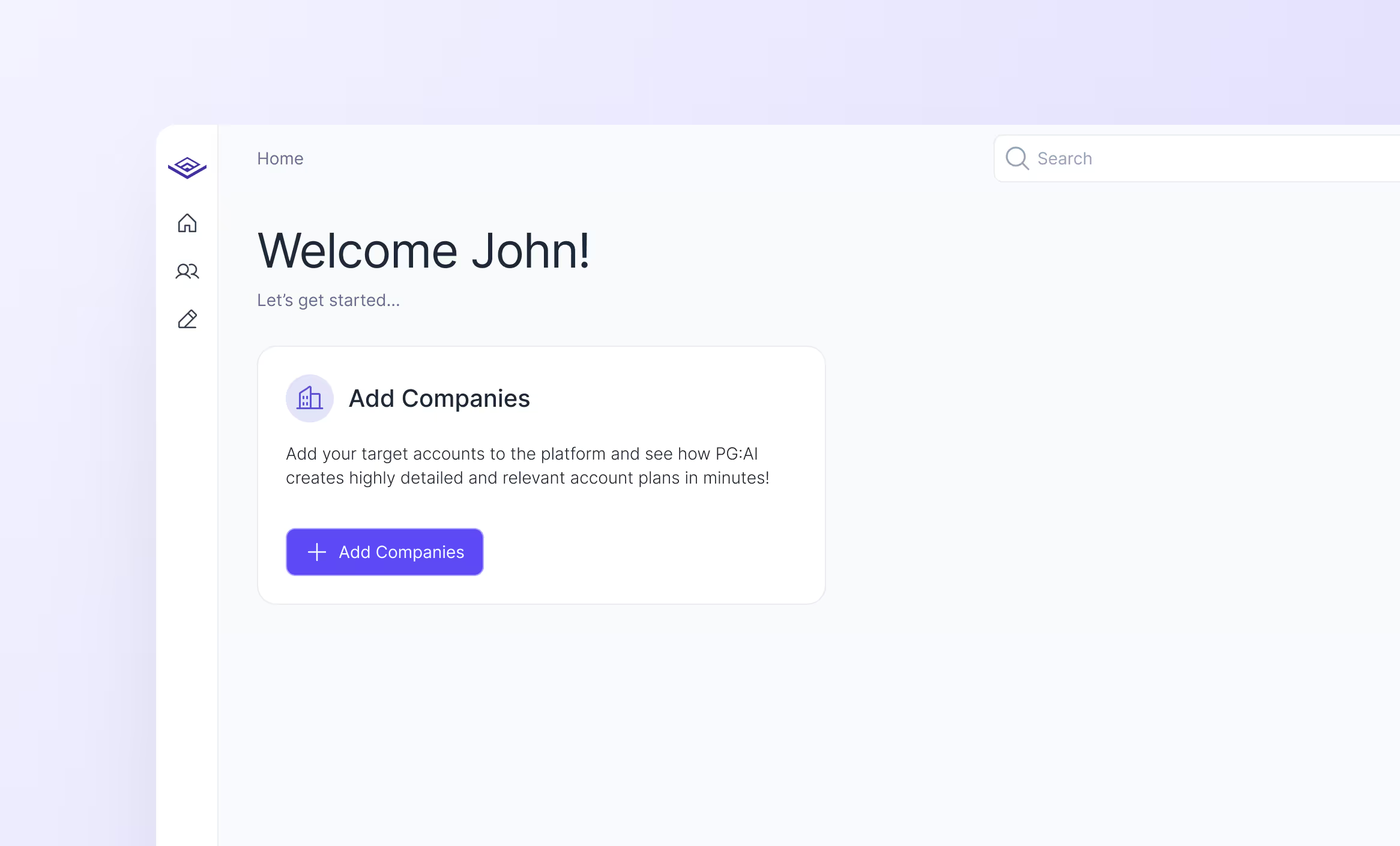
Empty state for companies page
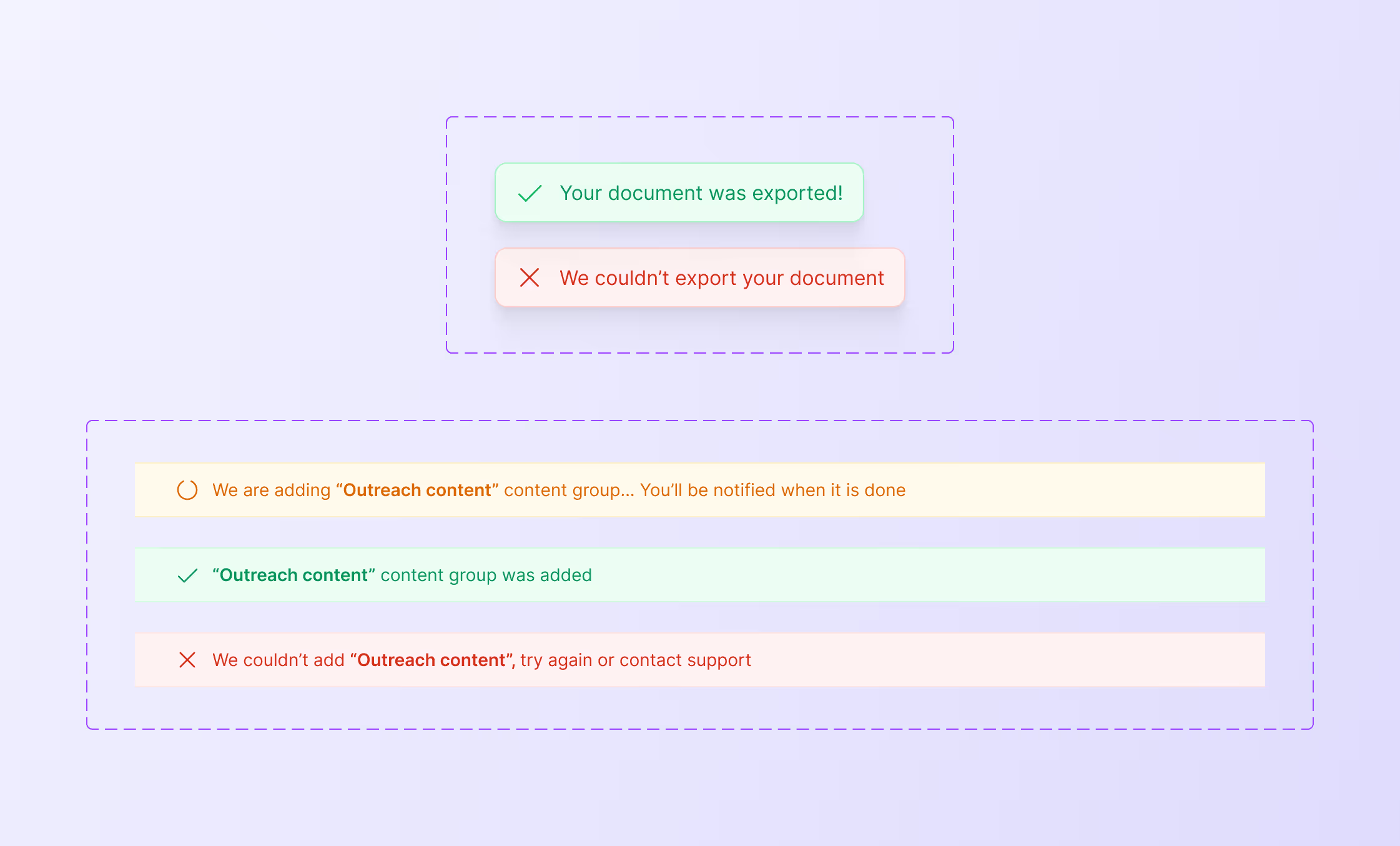
Alerts component
Launching New Features
Besides the UI and UX improvements, we had a roadmap with new features and ideas we wanted to build, so we started working on them.
Helping sellers engage better
Nowadays, with the number of AI SDRs and automated messages, it is difficult to create authentic connections. In this scenario, generic outreach messaging doesn’t work. PG:AI was already helping salespeople identify the accounts to focus on and get a deep understanding of their priorities and challenges. But we knew there was a need to generate ultra-specific content to be able to engage and connect with people.
One of the core principles of PG:AI is that, no matter how much AI and automation are present in today’s sales, human connection will always be the key to success. So, with a clear purpose, we started thinking about how we could use AI and all the information available to create content that allows salespeople to connect effectively with their prospects.
The first idea was to create outreach emails using the context data. Since the platform had access to the value proposition of the organization, as well as the prospect’s priorities and challenges, the results were very good.
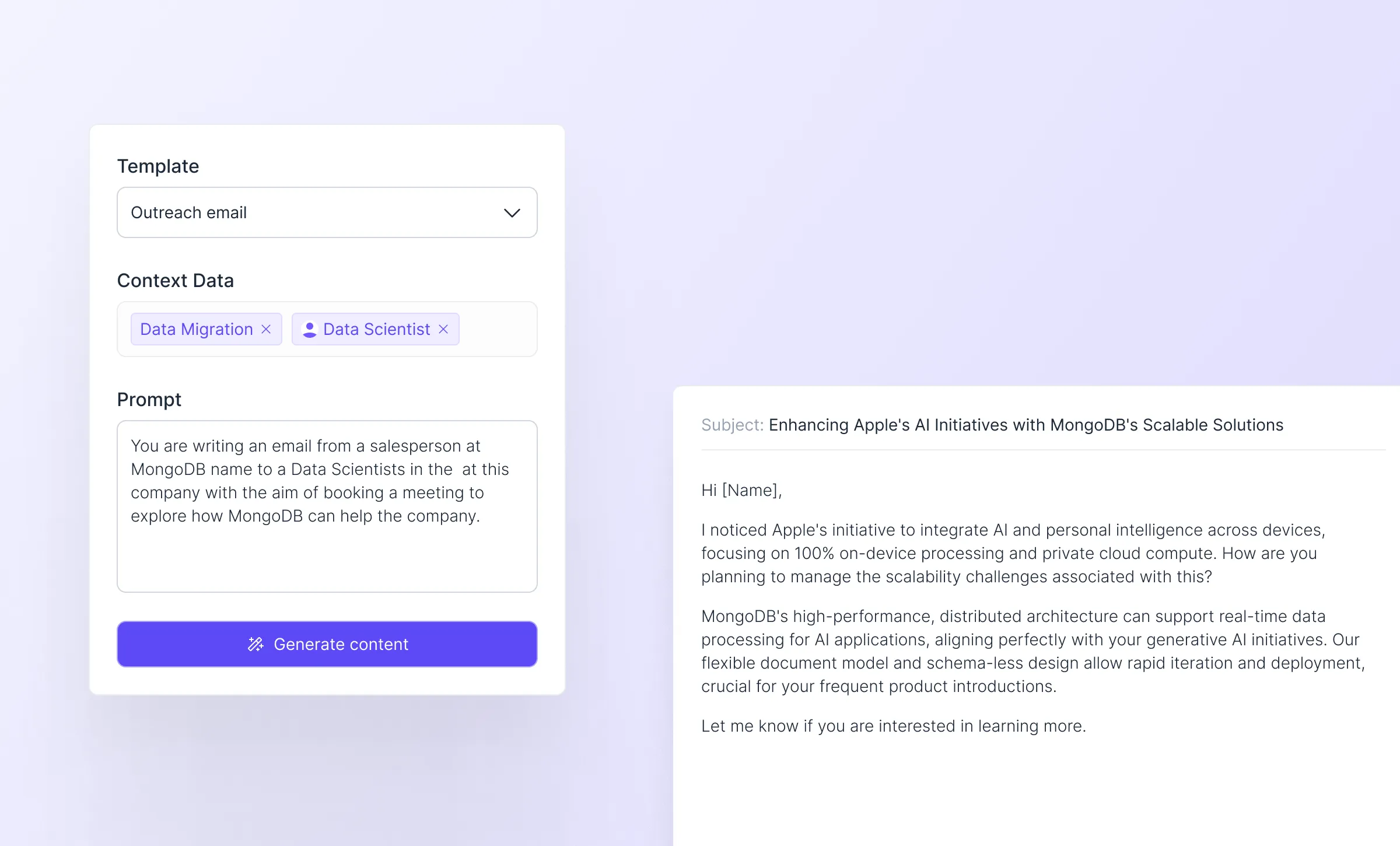
But we realized that we could also generate call scripts, value hypotheses, slide decks, discovery questions, and more. By allowing users to add context data such as contacts, departments, initiatives, and insights, and by providing templates, we knew it was going to be a powerful tool.
With this in mind, we built a template generator and a content gallery where users can access all of their documents. This is the current state of the feature, but we have plans to launch a template marketplace and make further improvements in the next months.
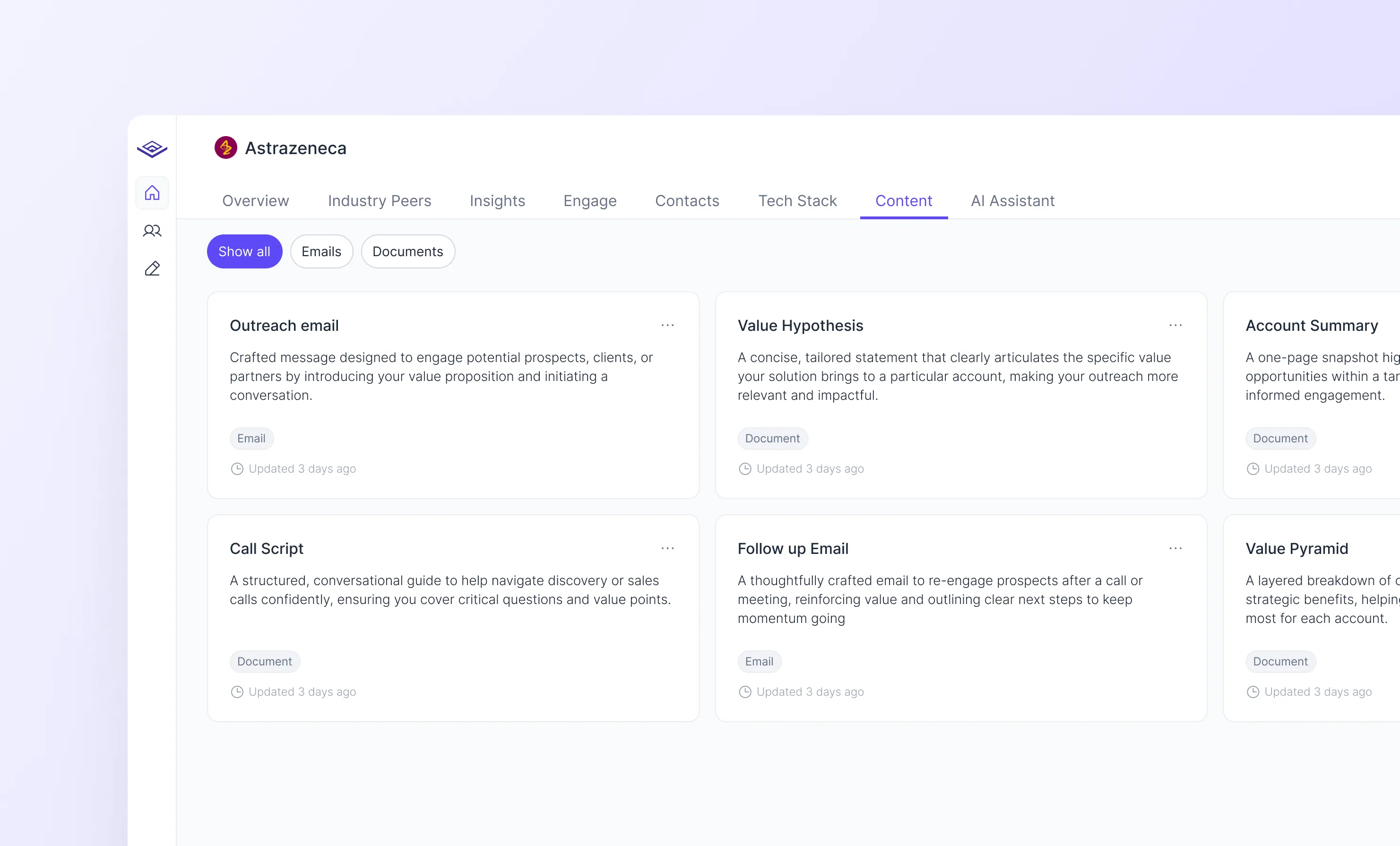
Content Gallery
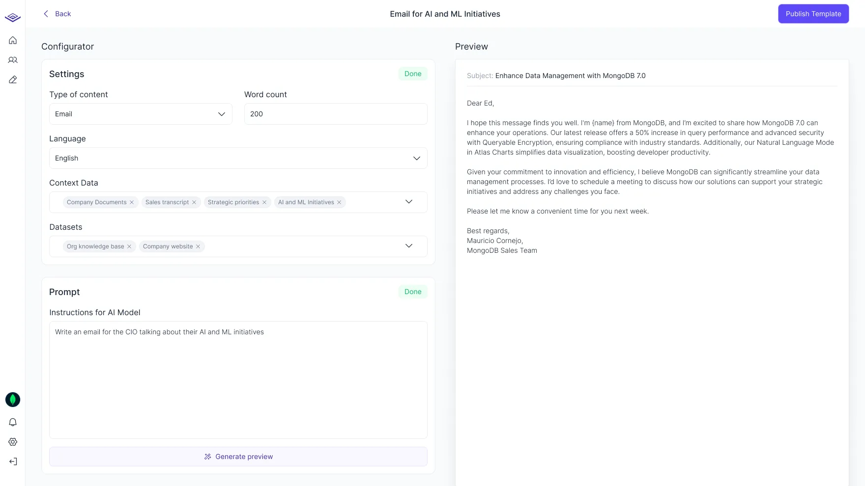
Template Generator
Introducing Collaboration
One question we always asked ourselves was: How can we get more people to use the app? We knew that people found PG:AI to be a very useful tool, but they were mostly using it to get information about something and then leaving. Our vision was to make it a collaborative workspace where people could work with their teams and AI to better understand and engage with their prospects, instead of just using it as a source of information.
One thing that all “Workspaces” have in common is the ability to make comments and tag your teammates. And that’s no coincidence. Comments in PG:AI would allow users to add their input and ideas on top of specific initiatives, strategic priorities, insights, and more. This is a stepping stone toward better collaboration and communication by providing context.
The other piece of the puzzle was a notification centre, so users can be notified when they are tagged in a comment and stay up to date with everything going on in their accounts.
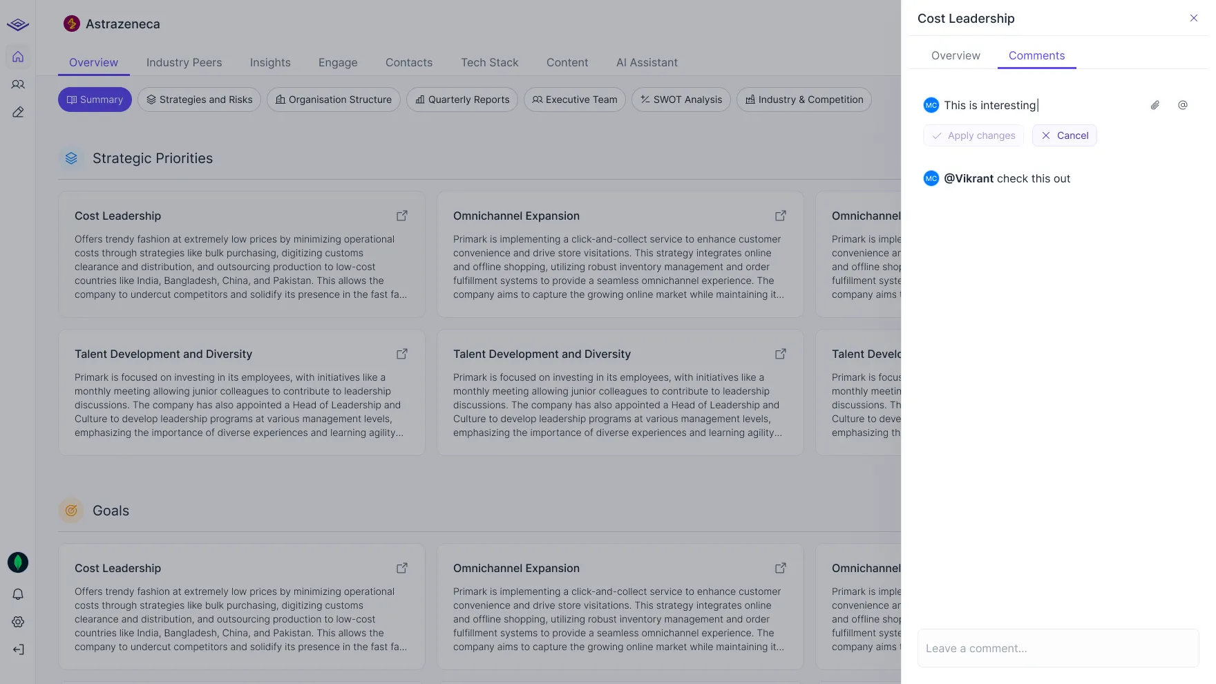
Comments
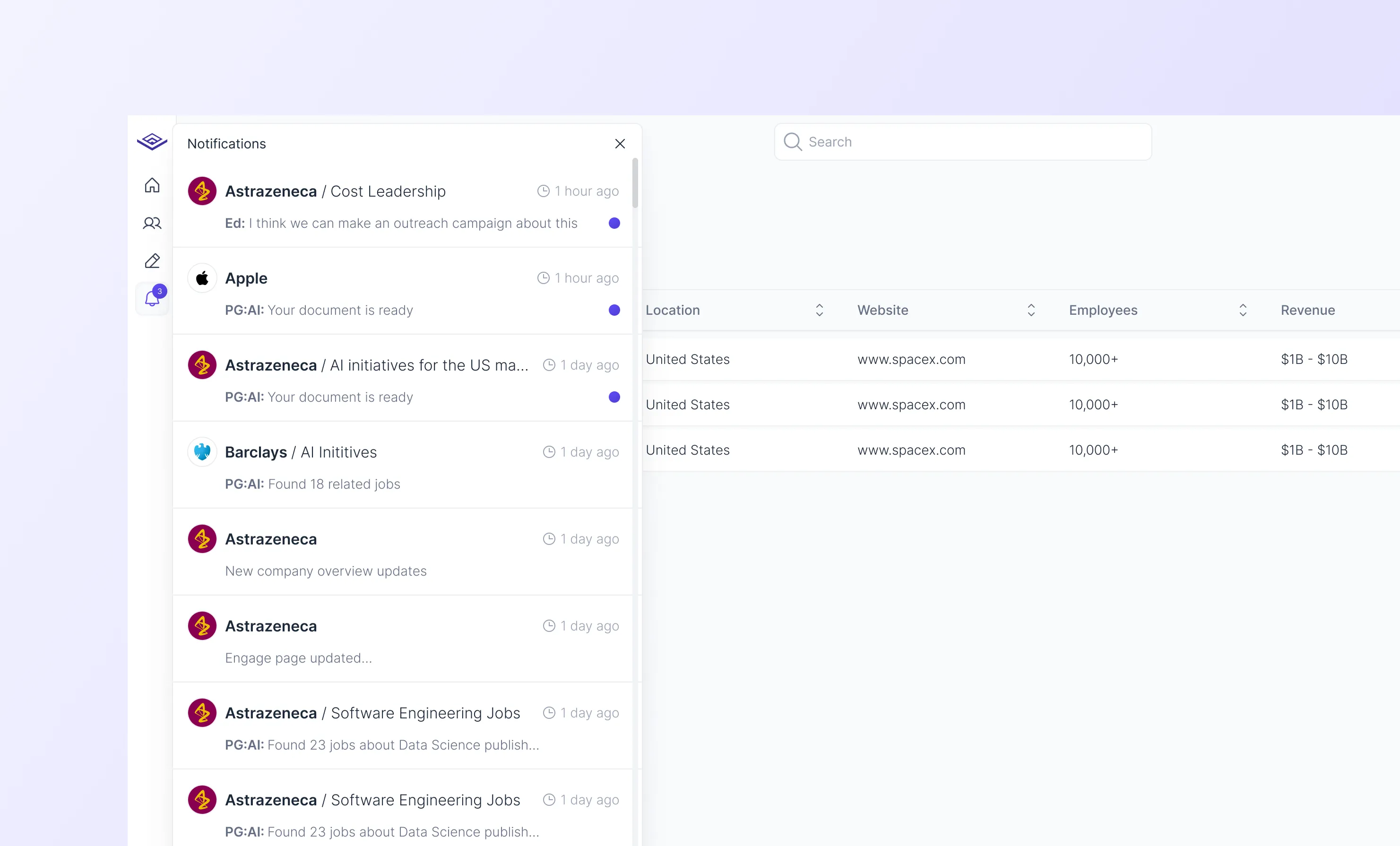
Notifications
This was great, but we noticed it was only useful for current users. We needed something that could help us bring in new users.
The answer was a little obvious, we should make it possible for people to share their account plans. This would encourage users to invite their teammates and get more people into the app.
After some thinking, we also realized that people should be able to view an account plan without creating an account. This would remove friction and allow them to immediately see the value PG:AI offers.
That’s why I designed a sharing experience that allows users to:
a) Share an account plan with current workspace members
b) Share an account plan by inviting new users to their workspace
c) Share a public version of an account plan with anyone

We’re still building this feature, so there’s no feedback yet, but we expect it to help bring in more new users.
Allowing deeper understanding with industry analytics
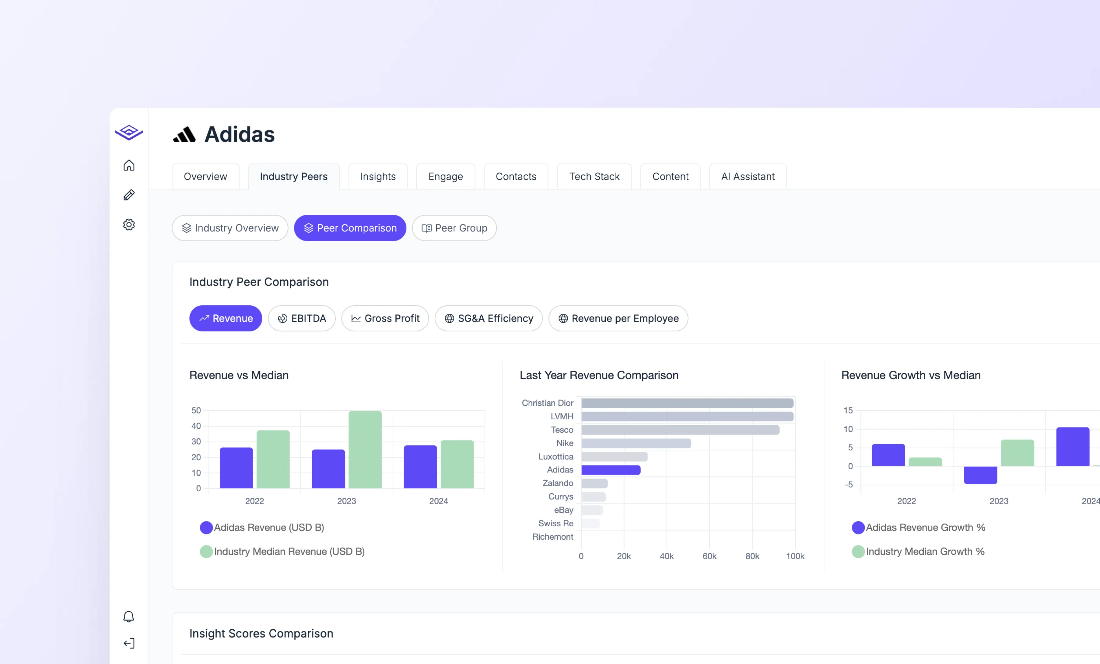
Another feature we launched was the Industry Peer Analysis. This allows users to access detailed financial metrics of public companies and view broader industry trends. We knew that people often look at quarterly reports to find information like revenue growth, EBITDA, cash flow, and more. It’s also common practice to analyze these metrics against industry benchmarks and compare them with key competitors. With this feature we enable them to can access all the relevant information in one place.
It was the first time I implemented graphs and complex data visualization in a product. When working with graphics and dynamic data, there are some limitations you should take into consideration. In this case, we used Chart.js to build the components. While it’s a great tool, creating custom graphs can be quite tricky. That’s why I think it’s important to stay flexible with your designs and always try to go beyond Figma.
Website Redesign & Development
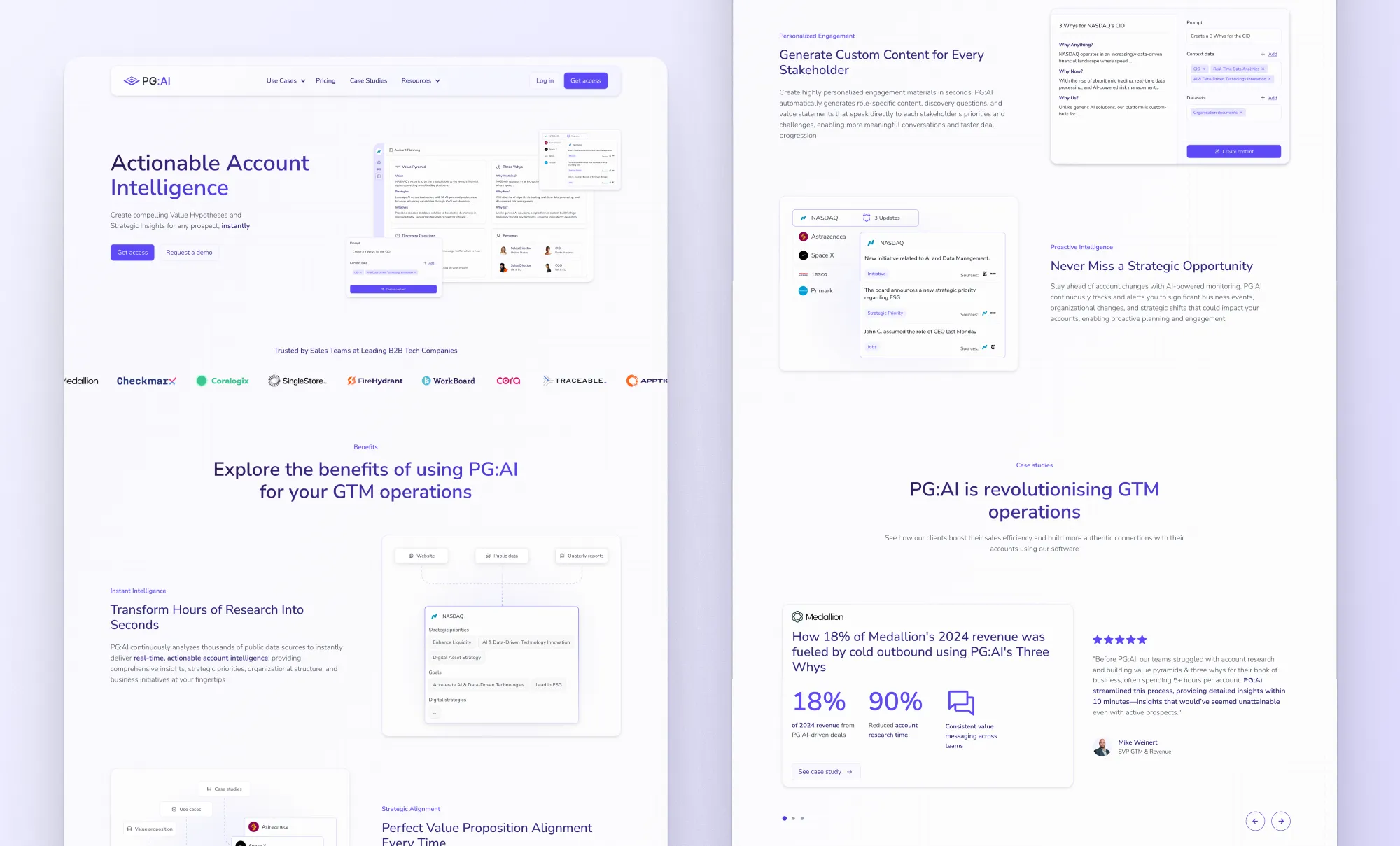
Ironically, some months after joining, I ended up redesigning the website. The Webflow build included around 10 static pages, including pages for each use case, and a CMS to display dynamic content like blog posts, case studies, product updates, etc.
We started with a workshop to figure out the strategy and messaging. After that, we used Relume to speed up the wireframing process, and once we had the structure and copy, I started working on the final mockups and developing the site. The process was highly iterative, but in the end, I was able to publish the new site and achieve some amazing results.
The new site drove more inbound leads in 30 days than the entire previous year, attracting CEOs, CROs, and VPs, while also increasing visitors by 10x in a few months.
Going Beyond Design
As I mentioned earlier, when you stay in Figma working with static designs, you leave quite a bit on the table. A lot can change once the designs are implemented in the product. Micro-interactions, hover states, and edge cases like longer-than-expected content can all affect how smooth the experience feels. These small details make a big difference.
This and also the fact that I am very curious led me to get involved in building and refining the product using low-code tools like WeWeb for the frontend, Webflow for the website, and Xano for the backend.


I wouldn’t call myself a developer, but with the current state of AI and low-code tools, I feel pretty comfortable building things. Having a solid understanding of HTML, CSS, and some basic JavaScript goes a long way.
04 Results
The Impact in Numbers
- +402% increase in Monthly Active Users from Nov ’24 to Apr ’25
- +359% growth in Annual Recurring Revenue over the same period
- 10× growth in website traffic, leading to a consistent stream of inbound leads including CEOs, CROs, and VPs of target companies
Of course, I’m not saying these results are all because of me, but when you’re working with early-stage startups and small teams, the line between product, design, and business outcomes gets pretty thin. I like to think the work I did played a meaningful role in where PG:AI is today.
05 Conclusions
How this shaped me as a designer?
Learning not to get attached
Many times I presented an idea or a design concept and it was immediately discarded, maybe because it wasn’t technically feasible, it would take too much time to build, or it just wasn’t good enough. I realized that this often made me feel like I wasn’t good enough, or sometimes even a bit frustrated.
Then I realized that just because one design doesn’t work, it doesn’t mean you’re a bad designer. In fact, I would say about 90% of the work you do as a designer in an early stage startup will never see the daylight. I just started trying to understand the reasons and generating more ideas. Now, when this happens, I see it as an opportunity to explore more ideas and grow as a designer.
The most important quality to succeed as a designer in a startup
Because I already had some previous experience with startups, I had an initial hypothesis about this. But working with PG:AI confirmed it. High agency is the most important quality to succeed as a designer in a startup or a small team.
It is certainly a buzzword, but for me, and in this context, it means taking complete ownership of the product, having a vision for what you want to achieve, and taking action by doing whatever it takes to make it happen. I don’t ask for permission if I have an idea I want to work on. Most of the time I don’t know how to do it, but I know I will figure it out in the process.
This may not work in a corporate environment, where you have very defined tasks to complete, but I think it is the perfect mindset for working in a startup where everything is changing and uncertainty is the norm.
Shipping fast and getting real-life feedback
Working with PG:AI changed my view of the speed required to be successful in an early stage startup. I have always considered myself a very pragmatic person, never staying in theory but applying it to real life and learning through experience. But I was still thinking of the product development process as a linear one, starting with research, then designing, doing some usability testing, and after that handing off the designs to the development team so they could ship it.
At PG:AI we worked as a unified product team, getting from ideas to working prototypes within the product in days or even hours in some cases. This allowed us to get real feedback very fast, see what worked, and then keep building. I think this is the best approach now that we have tools that can accelerate the process. It gives you real data to learn from and allows you to move very fast.
End-to-end product scope
This is one of the most important things I took from this experience. I have always considered myself curious, and I think this led me to start learning design, HTML, CSS, some basics of JavaScript, and building fully working websites with Webflow. But I had never explored how the backend of an application works. This was my first experience covering the whole product development process, including strategy, design, frontend development, and backend. Of course I used no-code and low-code tools, and a lot of AI, but I now feel capable of building end-to-end products and applications.
Not only does this open a door for me to build fully working products, but it also gives me a huge advantage when working with technical teams by understanding how the product works and knowing what is possible and what is not.
The importance of micro-animations and going beyond design
As I mentioned before, I realized that if I stayed just doing static designs in Figma, I was leaving a lot on the table. Things like hover states, focus states, loading states, micro-interactions, or empty states make a big difference in how the product feels. It is vital to take ownership of this as a designer. Now I think about how I want the product to work and feel even when I am designing the first mockups in Figma.
"Mauricio is a fantastic designer and great to work with...
I highly recommend him and look forward to working with him again in the future"
I highly recommend him and look forward to working with him again in the future"

Ed Moore
Co-Founder